A few years ago when I made my first Portal sign, I made a lot of mental notes about improving the project. I never really planned to do it again, but I knew what I would do differently if I did.
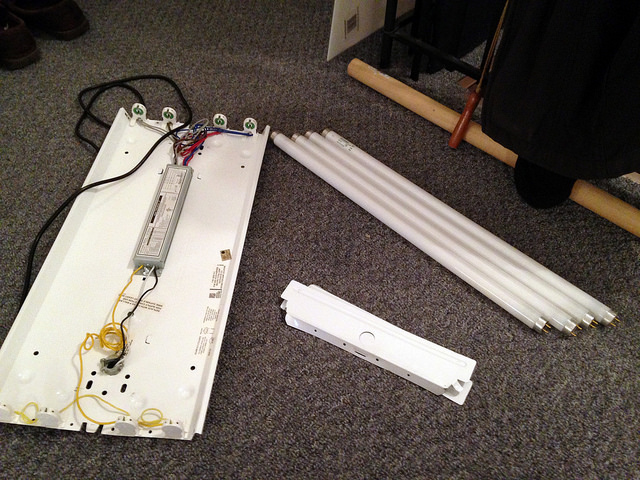
Well, a couple weeks ago I found a fluorescent light fixture at a thrift store for $5 and I knew it was time to try again.
The light was about 13 inches across and 26 inches tall. I figured I would make the sign to match those dimensions.
The light came with an ugly rounded plastic diffuser, which I discarded, and I had to supply my own power cable, but for $5, you can’t beat this type of deal.
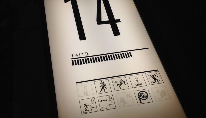
I “had to” play some Portal… for “research” and actually to get some screenshots. Unlike my last sign, I wanted to base this one completely off an actual in game sign. I decided to go with Chamber 14.
I captured some screenshots from a number of levels, straightened the pictures in photoshop and printed out a few grids to work with.
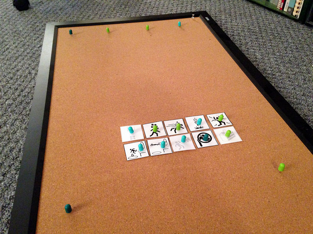
Once I had my dimensions down (the sign would be a little larger than my light) I printed out some test sheets and used a cork board to test my layout and sizing.
With my first sign I was doing all kinds of conversion math from centimeters to inches, and was super concerned about getting everything to look absolutely perfect. Since this sign would be smaller, I felt I had a little more flexibility, and knew from experience an eighth of an inch can be an acceptable margin of error. (I mean, Aperture Science isn’t really known for quality control. :)
The nice thing about this one, was that all the elements were small enough to be printed on 8.5 x 11 paper, so it was easier to made templates for everything.
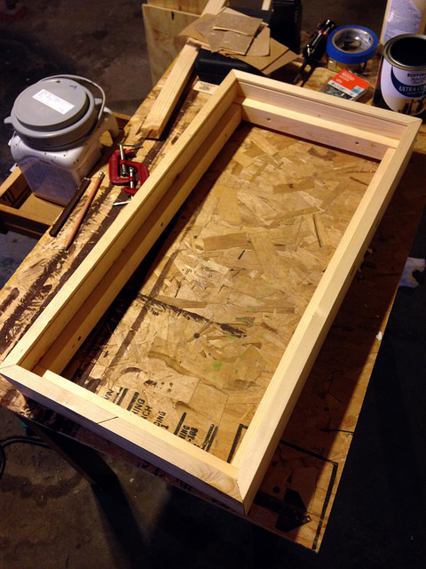
Frame design was similar to the last one, using a 1×4 with a groove near the top for the front plate. I didn’t have as many options for keeping it stable, so I opted to run a second frame around the inside edge to help reenforce the structure.
Once that was done, I painted the frame black, and started working with the sign front.
I still had both the adhesive vinyl and the adhesive transparencies from last time. The’ve been patiently sitting on a shelf for me, waiting to be used.
The most expensive part of this project, (half my proposed budget) was spent on a sheet of white acrylic. I used milk glass for my last sign and in addition to being really heavy, I’m always terrified it’s going to break, crack, or shatter. I’m glad I went with plastic for this one.
Pro-tip: if you’re doing something like this, try to curb your perfectionism and just make sure you’re enjoying yourself. There’s a lot of room for “error” with something like this, and each hand-built relic will have it’s own “character.” The point is not to create something that is perfect, but to create something cool that you can be proud of.
Fortunately, my measurements were pretty spot on, so fitting the panel into the frame was a pretty smooth process. I built the frame around the front, rather than built the frame and try to slide the front in. This worked pretty well.
The bottom piece I did last, and it gave me a little trouble. My fear was that if I put too much pressure on the plastic, it might crack, but it seems to have held up fine, though I think it might be a little tight.
A little bit of touchup paint, and everything was good to go. It’s a cute little version of it’s bigger brother, but it looks pretty slick. I’m quite happy with how it turned out.


