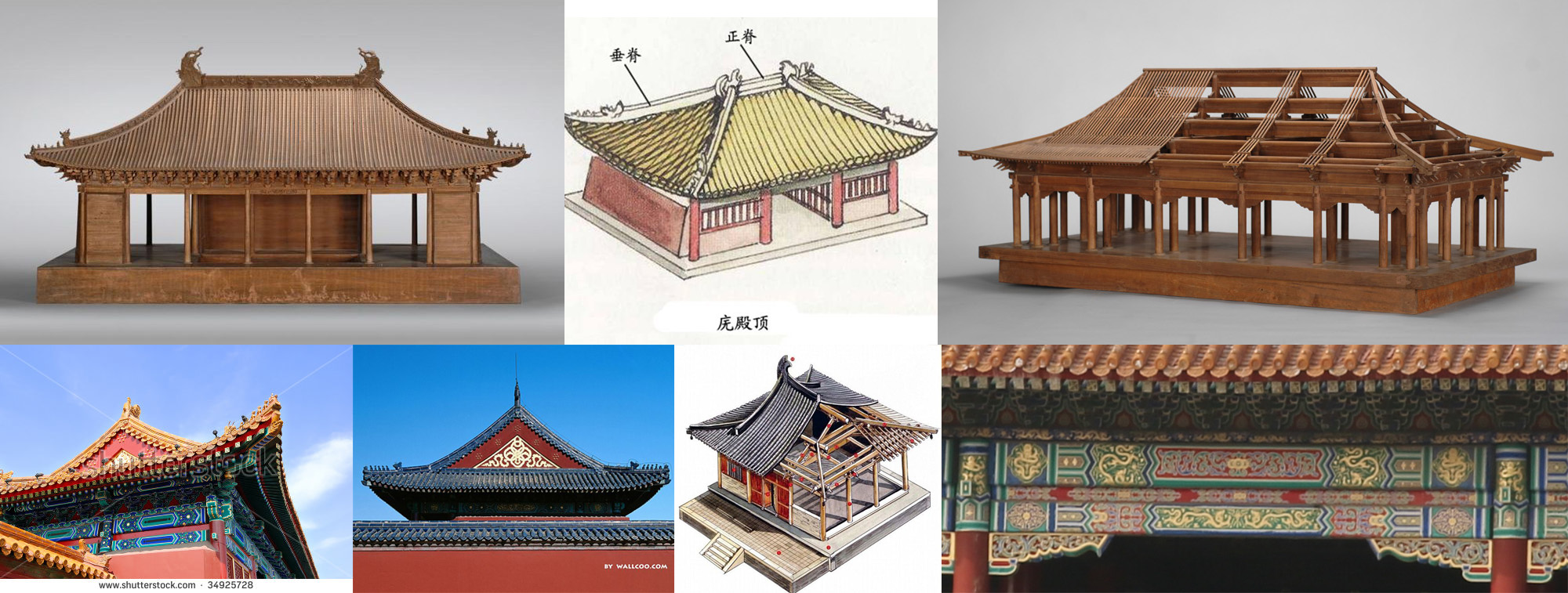
I spent a few hours doing image searches for Chinese architecture designs and Chinese roof designs for inspiration and ideas. But I was eager to start the process.
I started by building a box. I had some nice leftover 1x4s from a previous project. I made the sides three board-widths tall. Basically screwed/glued three cut boards together using my tiny little Kreg jig. I didn't take any photos of this part, because it was unexciting.
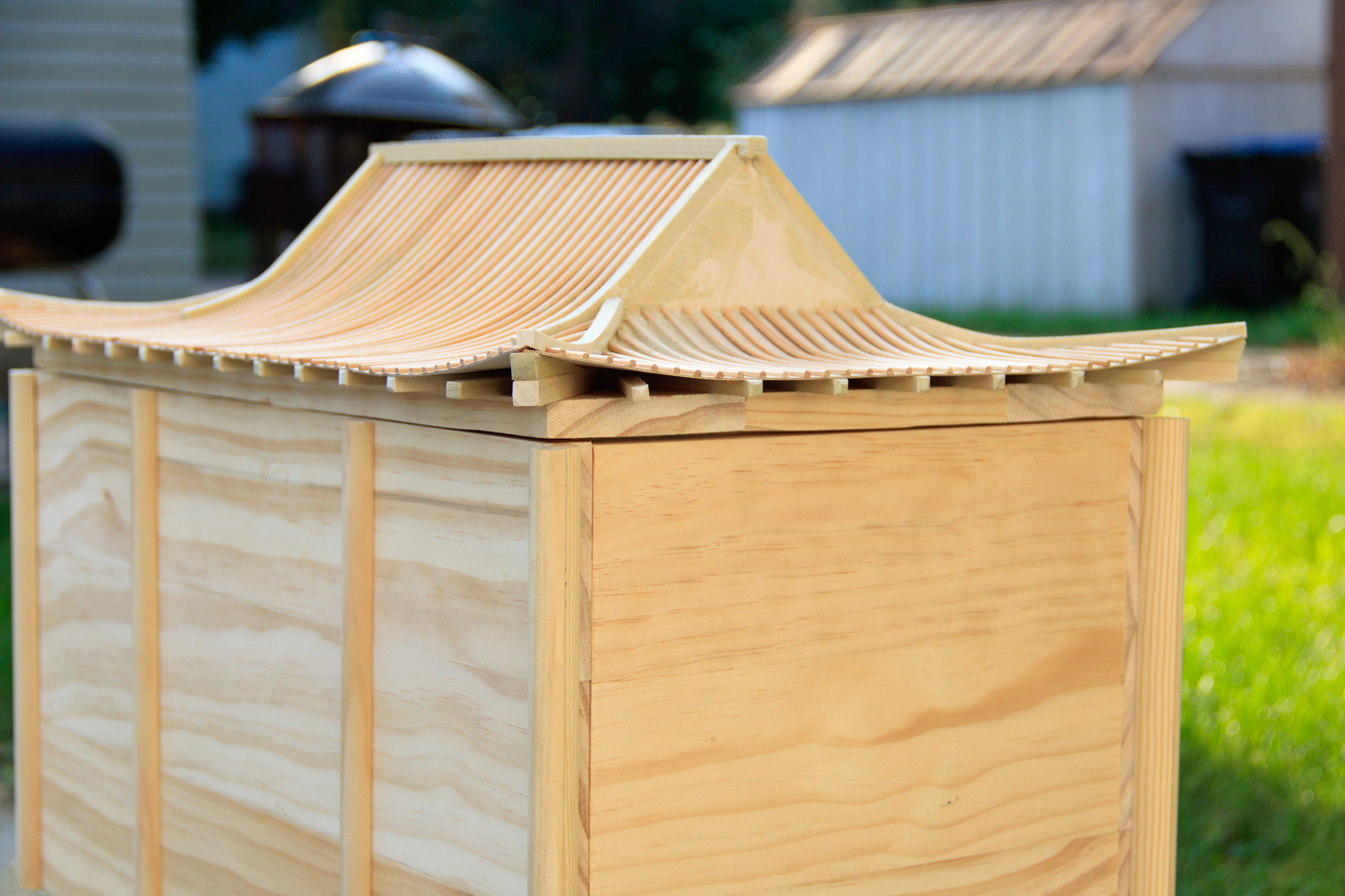
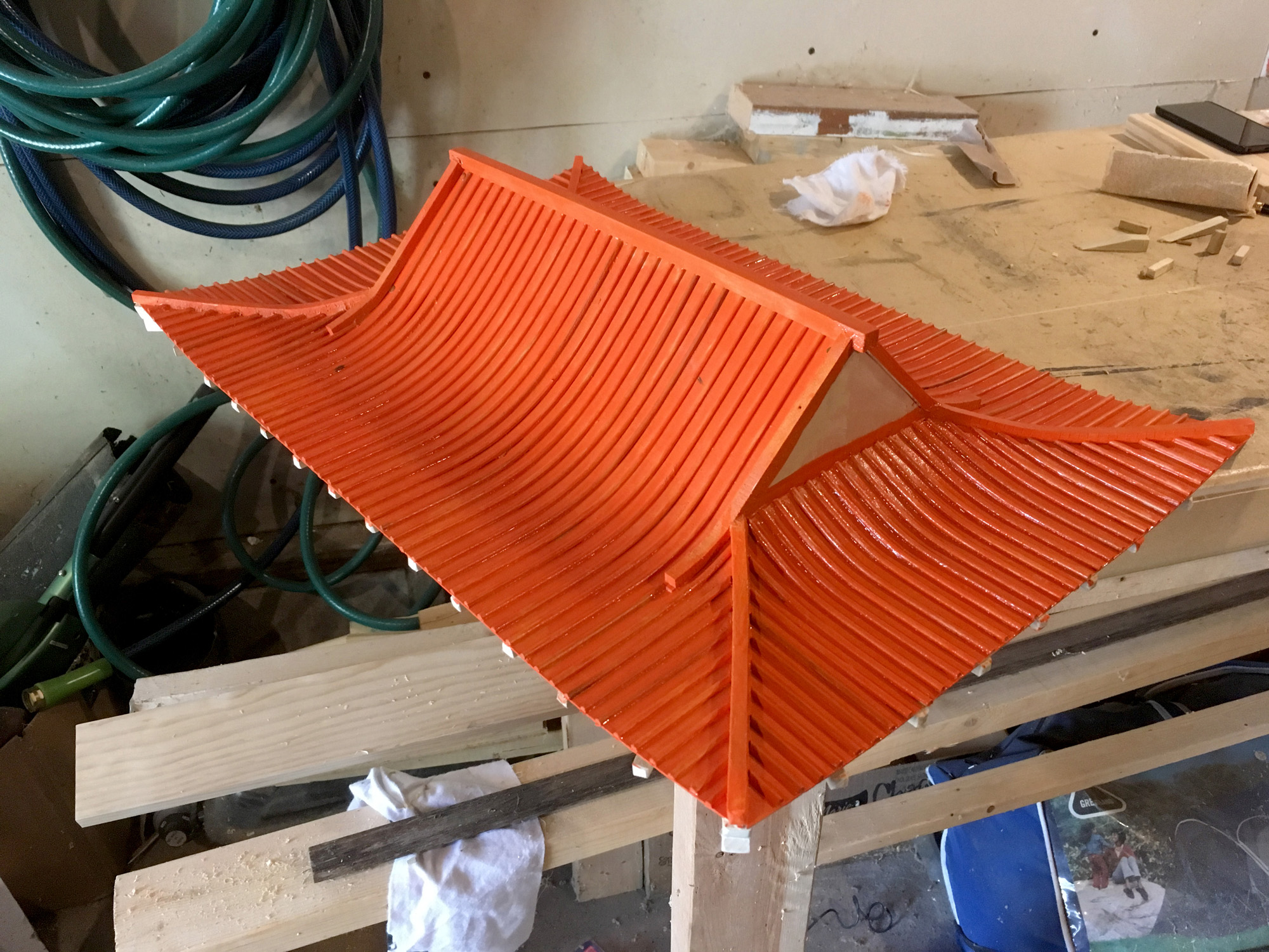
Things started to get interesting with the roof. Because it had to curve and it was going to be small, I decided to start with a simple frame. My goal was to be "reminiscent" of Chinese architecture, not to copy it completely. The eave supports I cut to a predetermined length and glued in place. For the corners, I used a thicker piece and created a small ramp upwards.
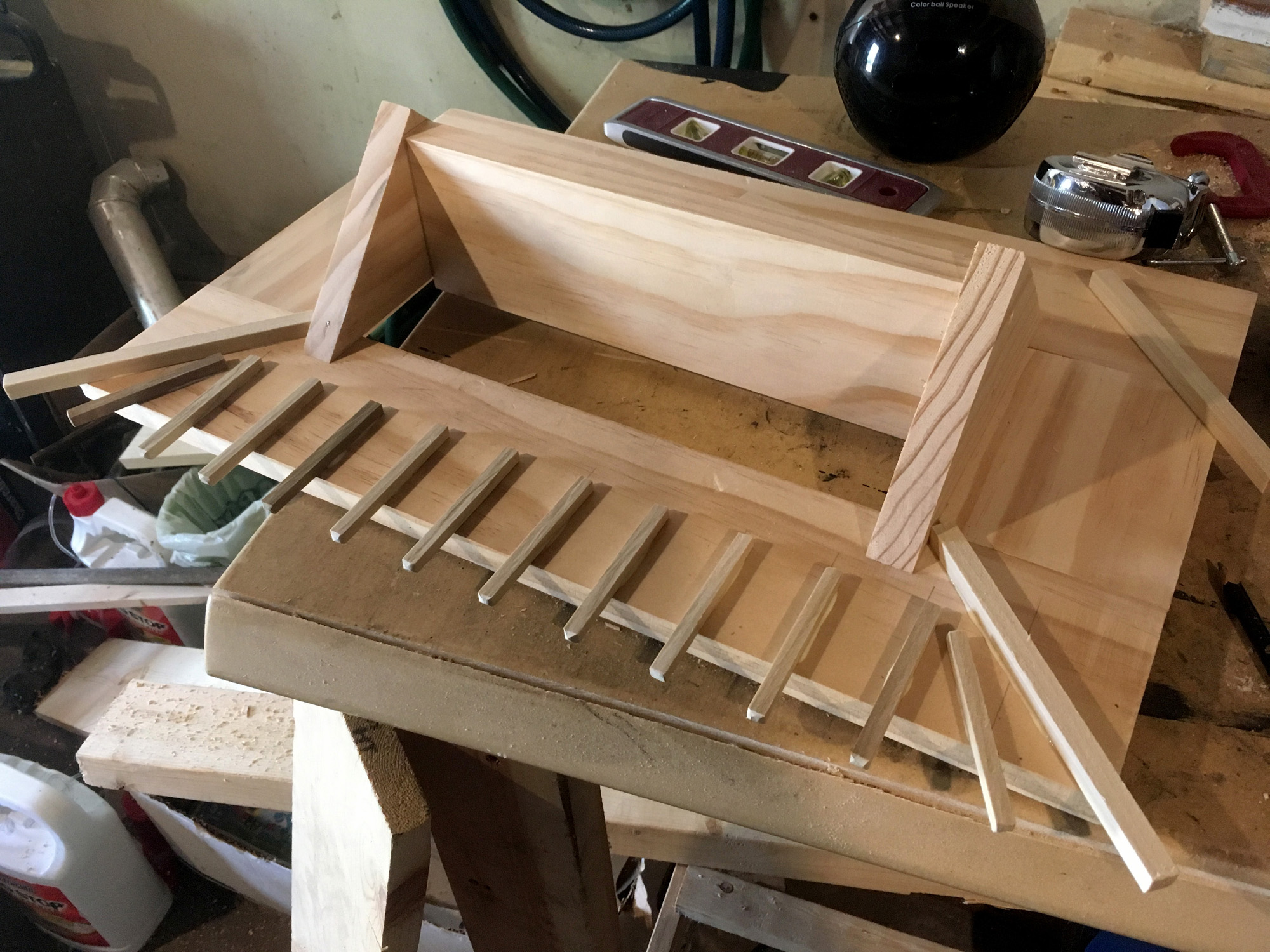
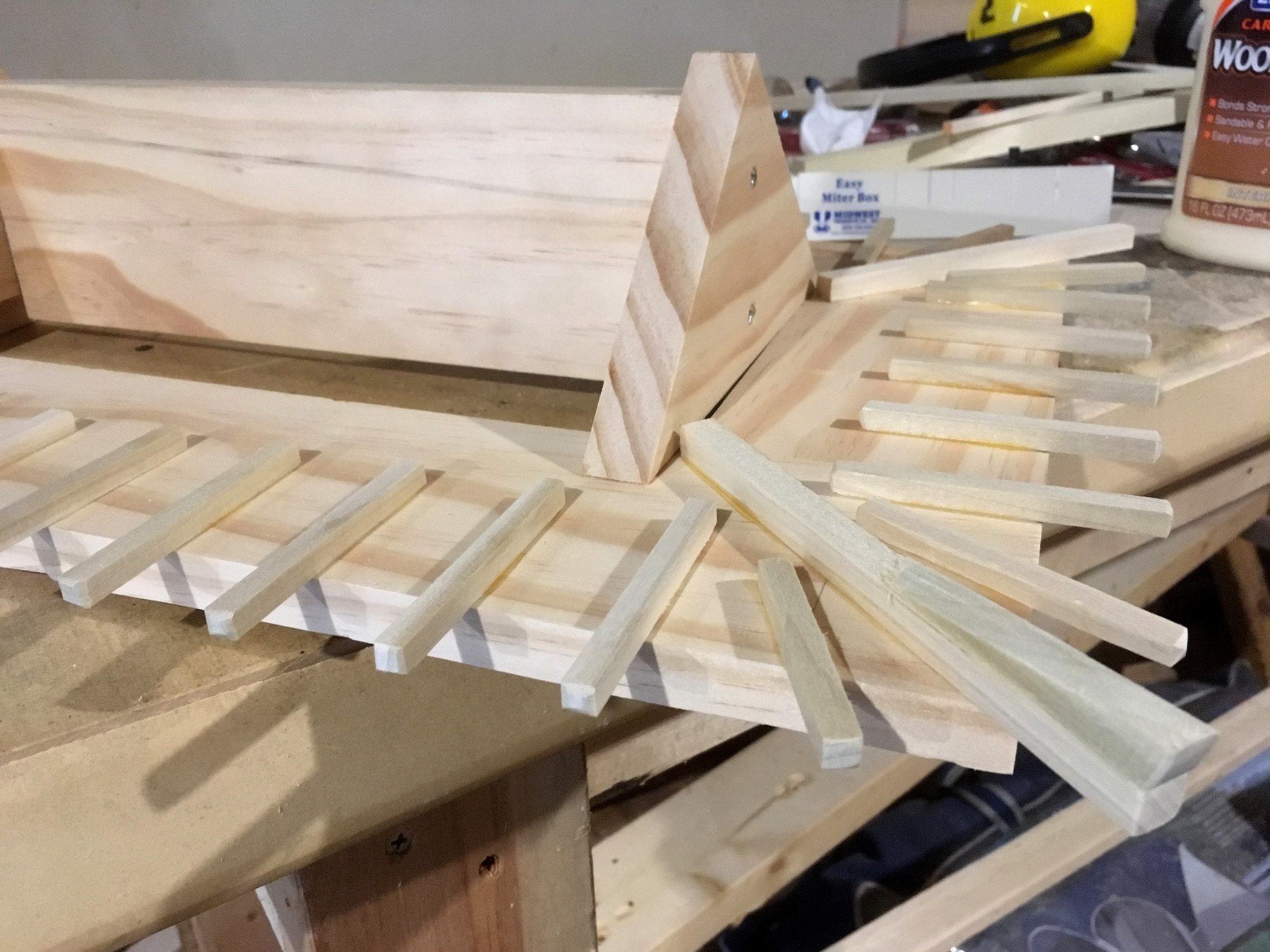
I experimented with some different ideas for the top facing and ultimately decided that 1/32" project board would be the best option. It was light and flexible enough to bend and glue in place without resorting to the difficulties of doing something that involved steam or water.
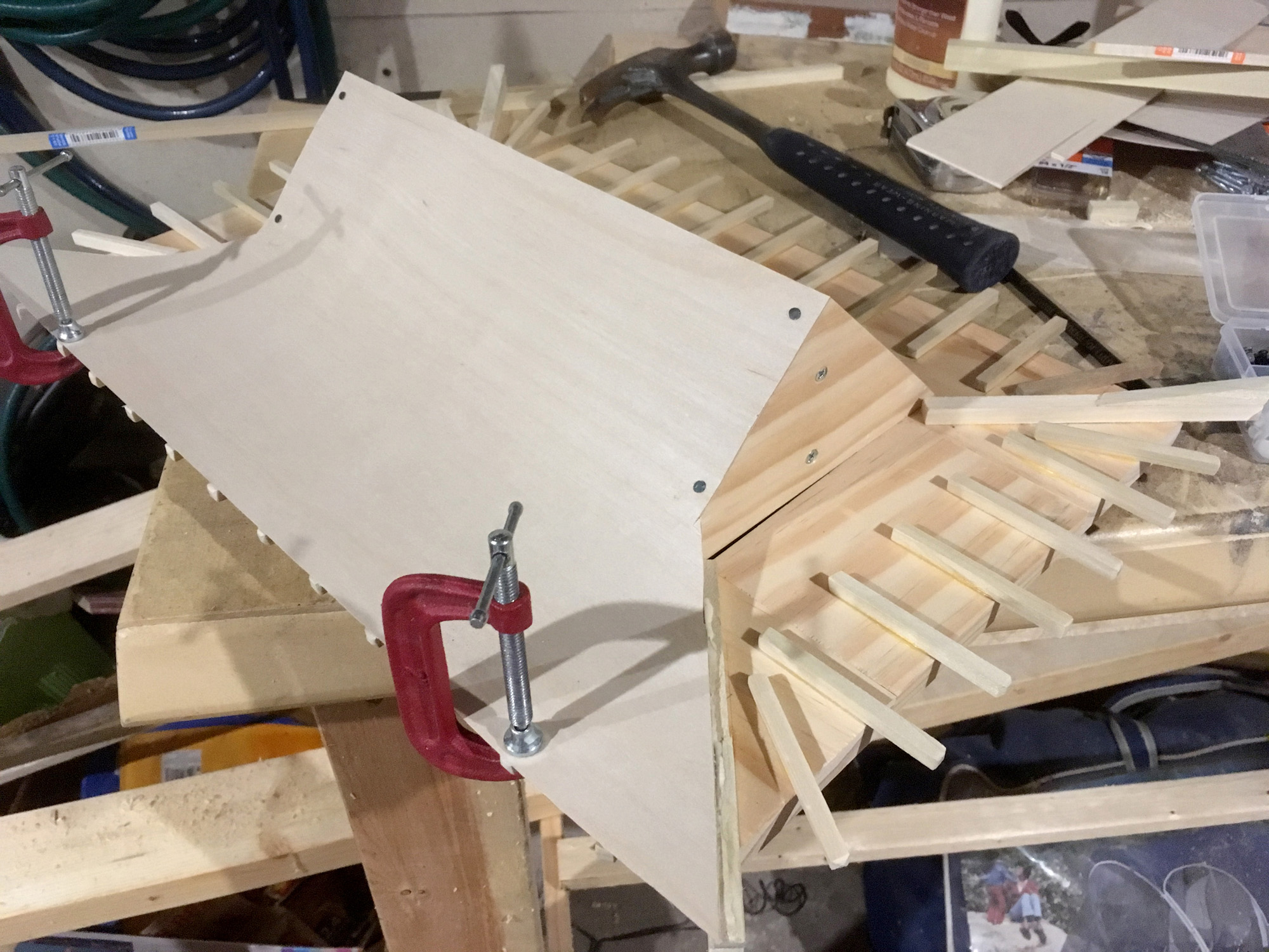
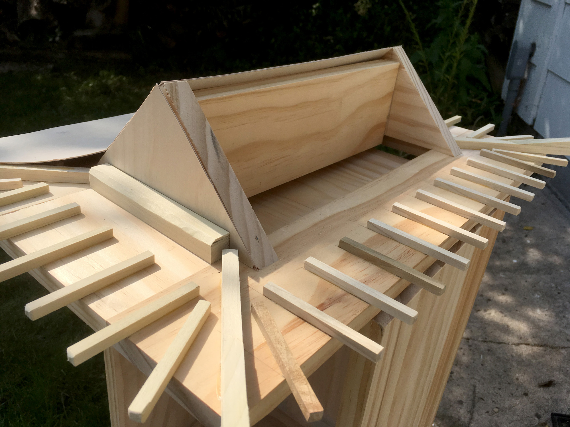
I used small nails to hold the top corners to the main frame as I waited for the glue to dry. Originally I thought I might pull the nails out after the glue set, but I ended up leaving them in.
Creating the rounded ridges was going to be a challenge. My first thought was just to use dowels. I could drill holes into the top beam and glue them into place. This idea was short lived, because I discovered an even better option. My grandpa used to wind motors and when my father inherited my grandpa's tool shop, he found himself in possession of a large collection of half-dowels. These long thin pieces of wood were used in the motor winding process and were not collecting dust in a corner. I was told I could use as many as I needed.
They came in a few different sizes. The one I ended up choosing was about 1/8-inch wide, maybe half that tall, and very flexible. The benefit to using these was that they had a flat size which was much easier to glue into place.
Before I could start putting those into place though, I needed to frame up my seams/corners. I used my remaining 1/4-inch wood pieces, cutting a plethora of slits into the top so it would easily bend to the curve I needed.
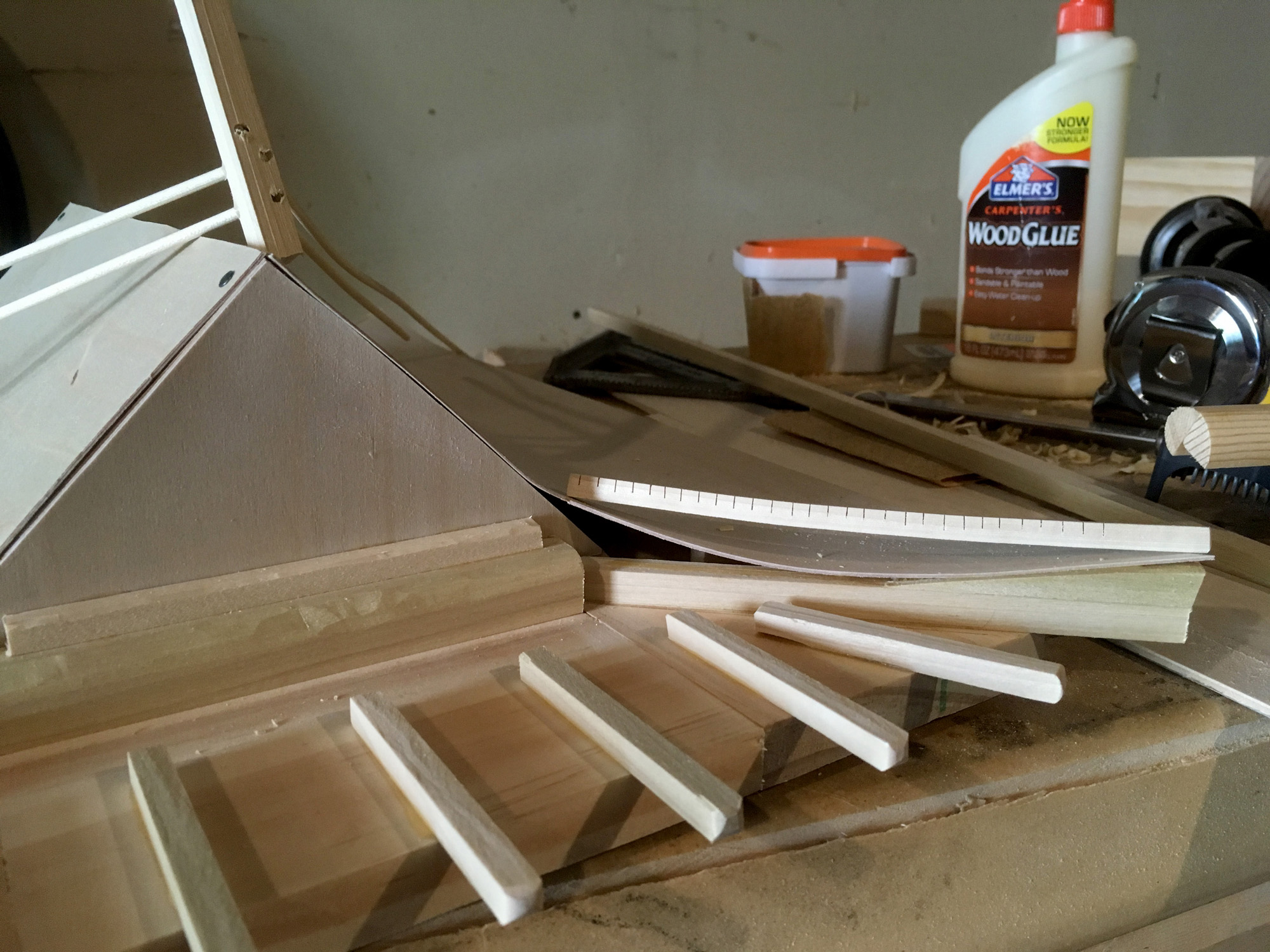
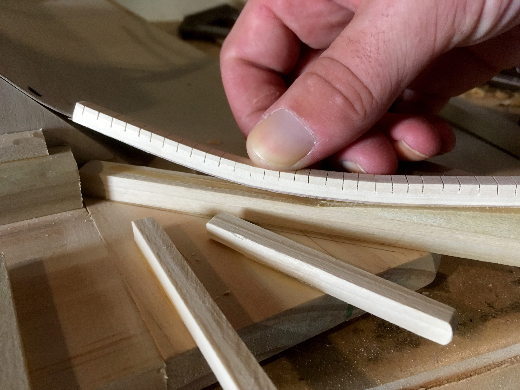
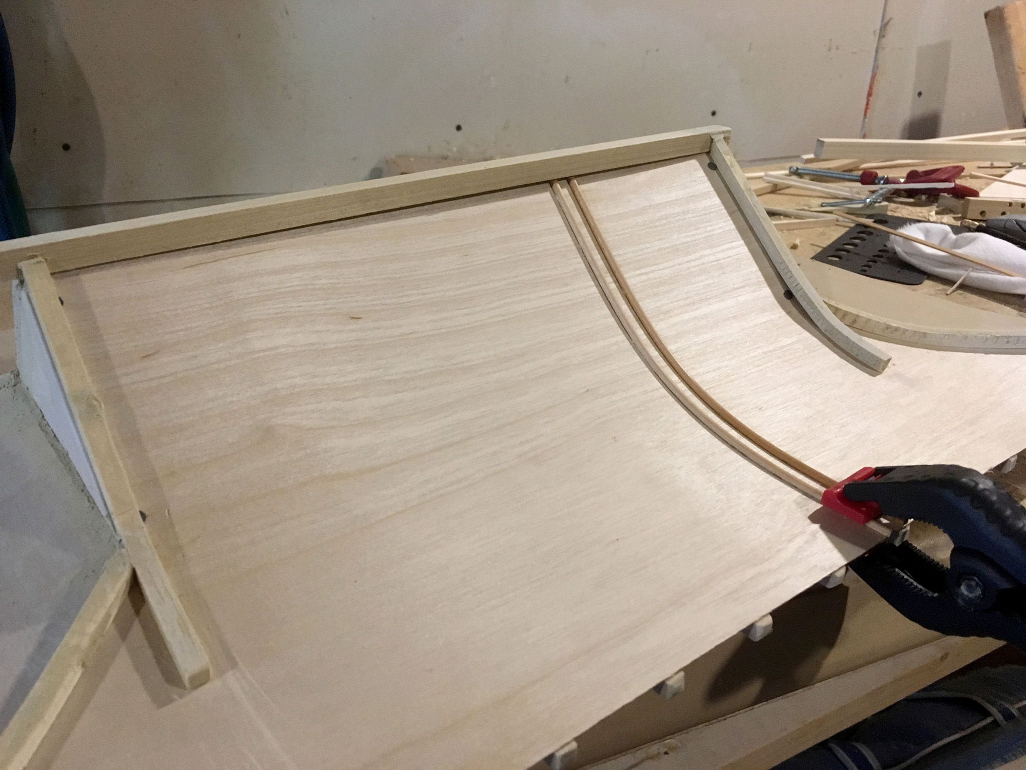
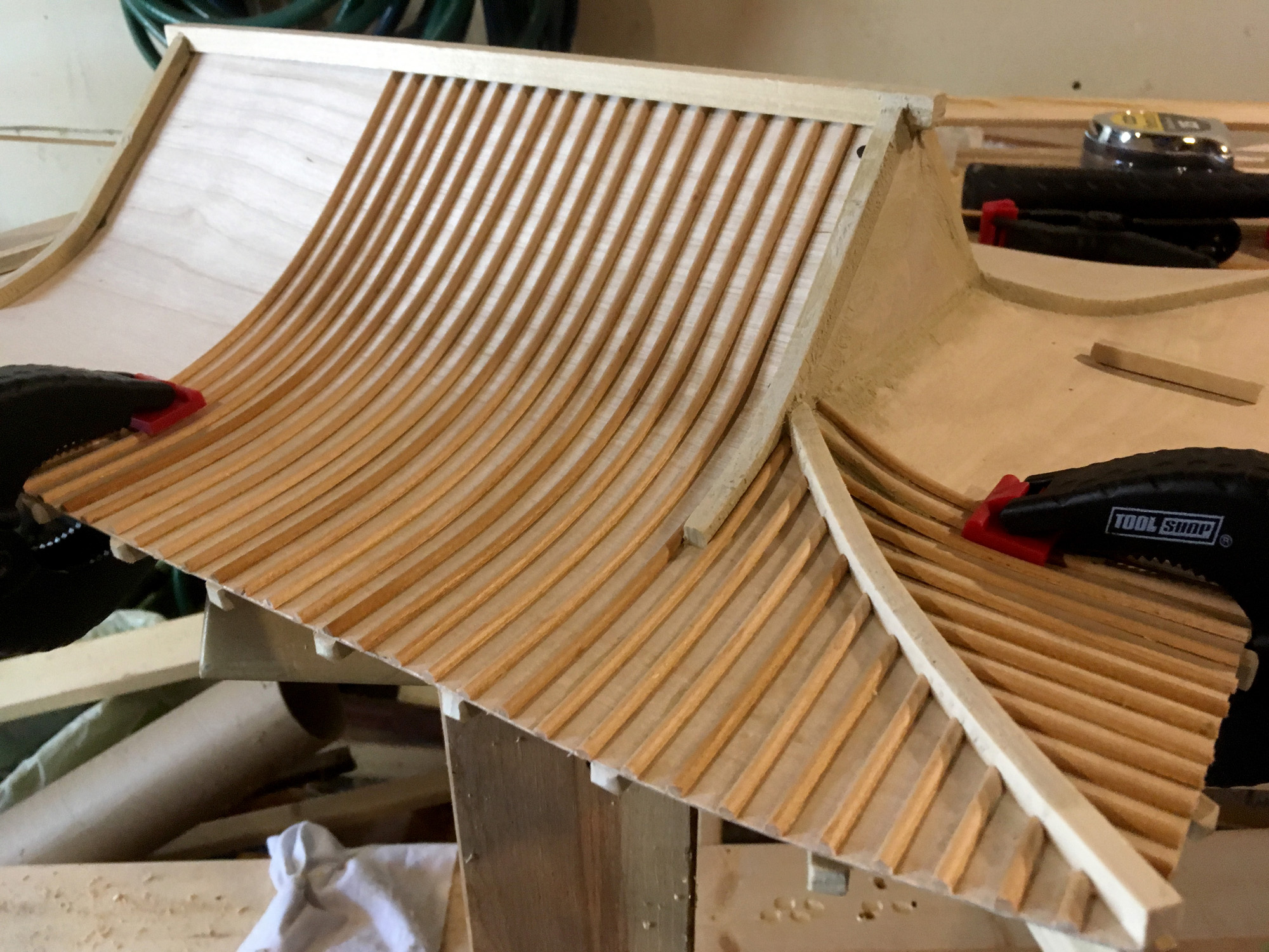
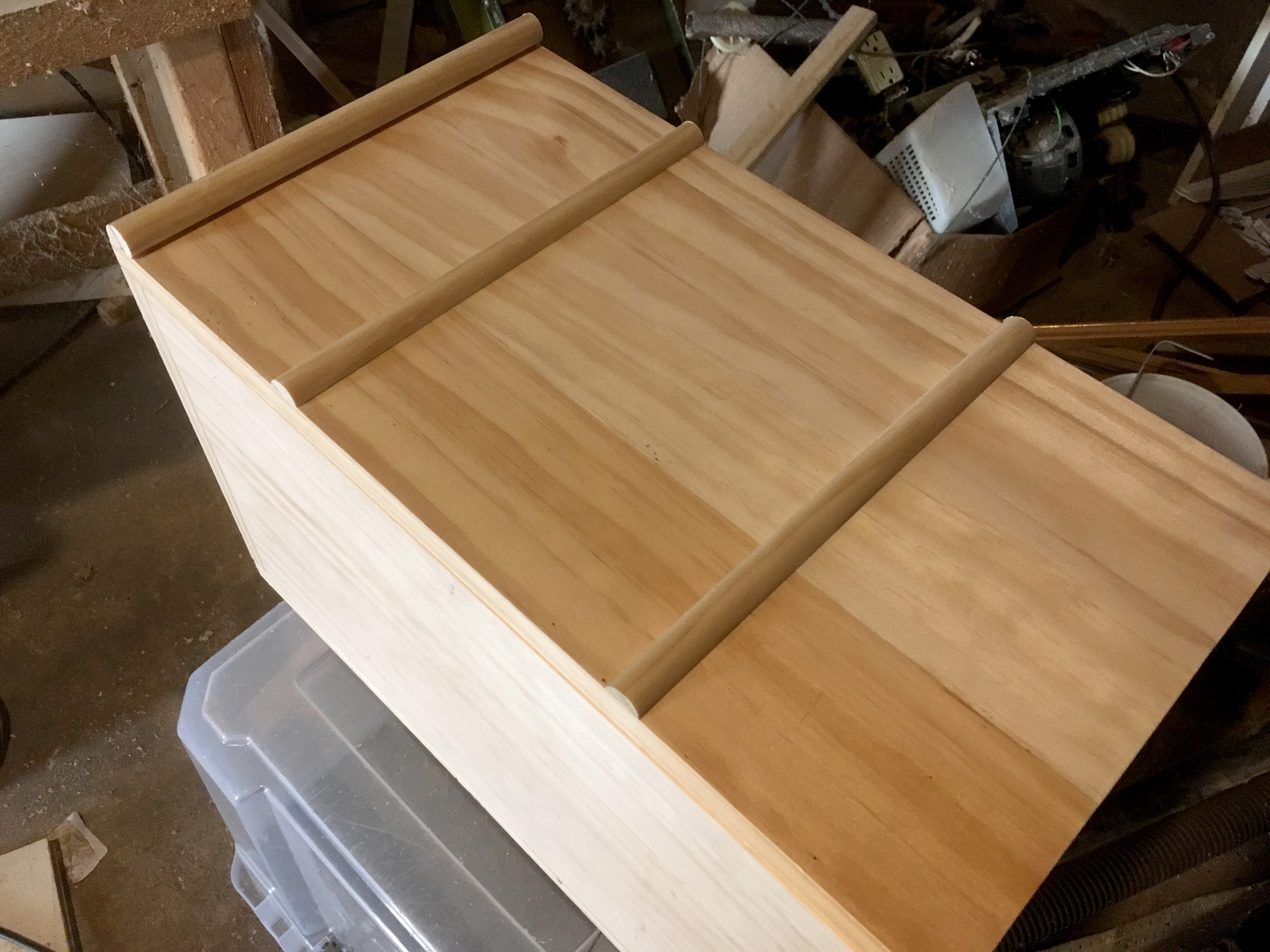
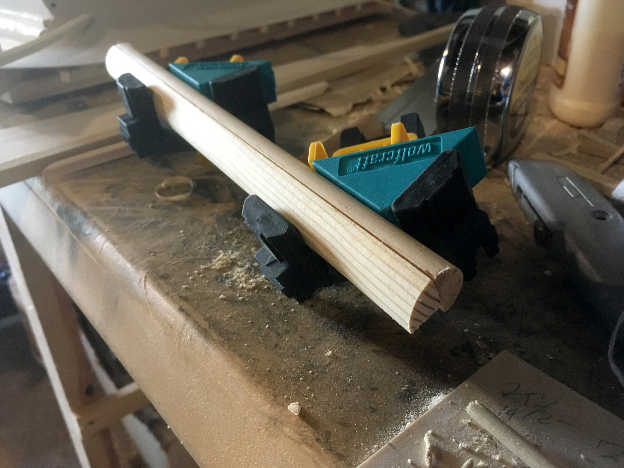
This part was slow. I had to clamp everything and wait for the glue to dry. Because of how things needed to be clamped together, I could only do a few at a time. Which left plenty of time to work on the box ornamentation. I wanted little pillars along the side and on the corners. The half-dowel for the sides was easy to find, but finding a 3/4 dowel proved to be impossible, so I made my own with a 1/2 dowel, a 1/4 dowel, and some glue. The dowels weren't the same size and I would have liked a little more choice, but the end result was not bad.
Once I had the roof and sides done, it was time to paint. I wasn't sure what I was planning to do for colors yet.
Part of me liked the idea of leaving it all bare wood, but I didn't feel it was clean/pristine enough to pull this off. I had too many little flaws that a little paint would help distract from. Also, I liked the idea of having something colorful to match the Chinese aesthetic.
But I did a little more digging and found more inspiration. I found this picture that looked really neat.
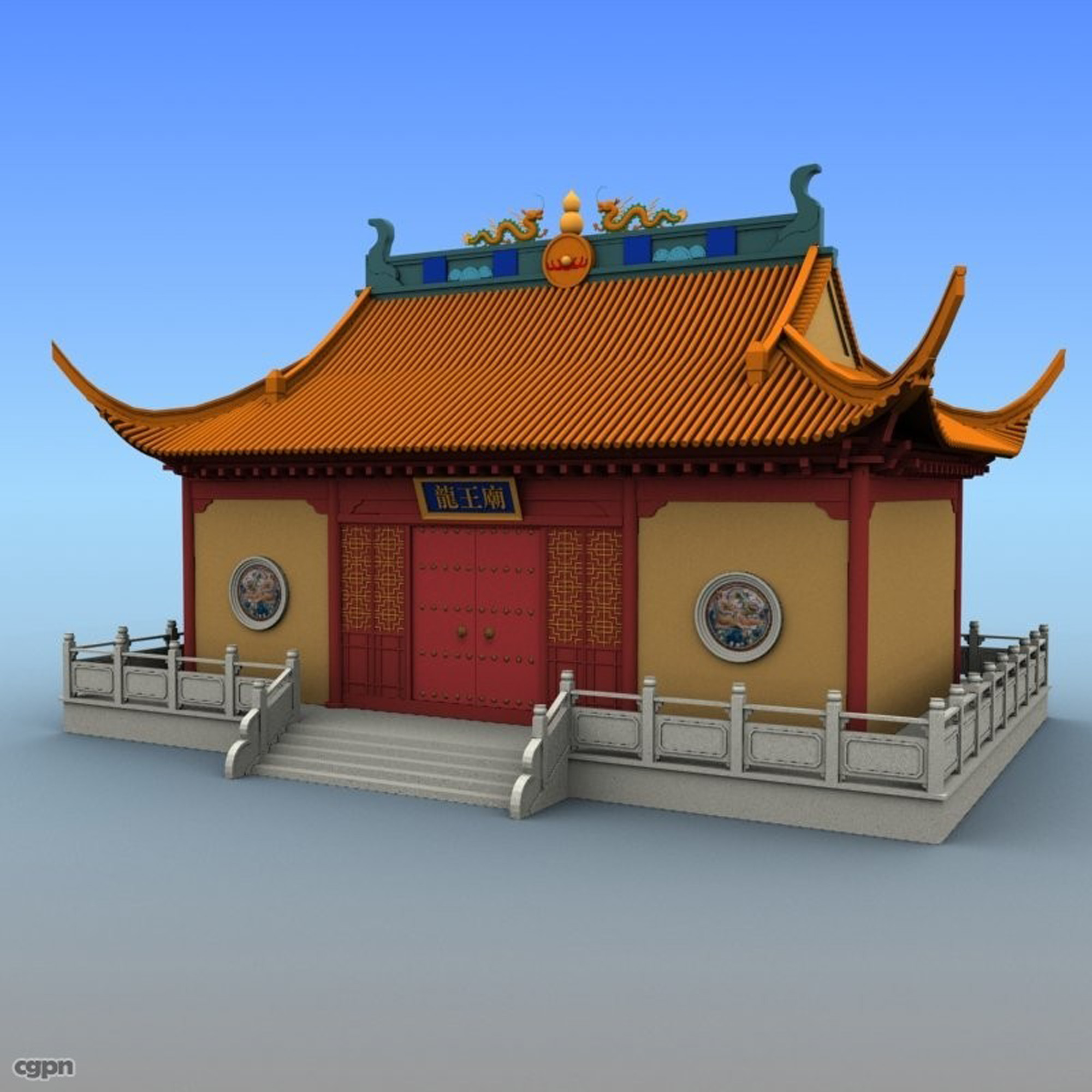
For some reason, I imaged the roof being blue. I mocked some stuff up in Photoshop and showed it to my friends.
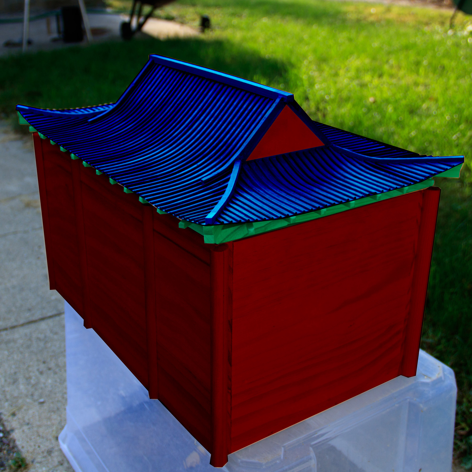
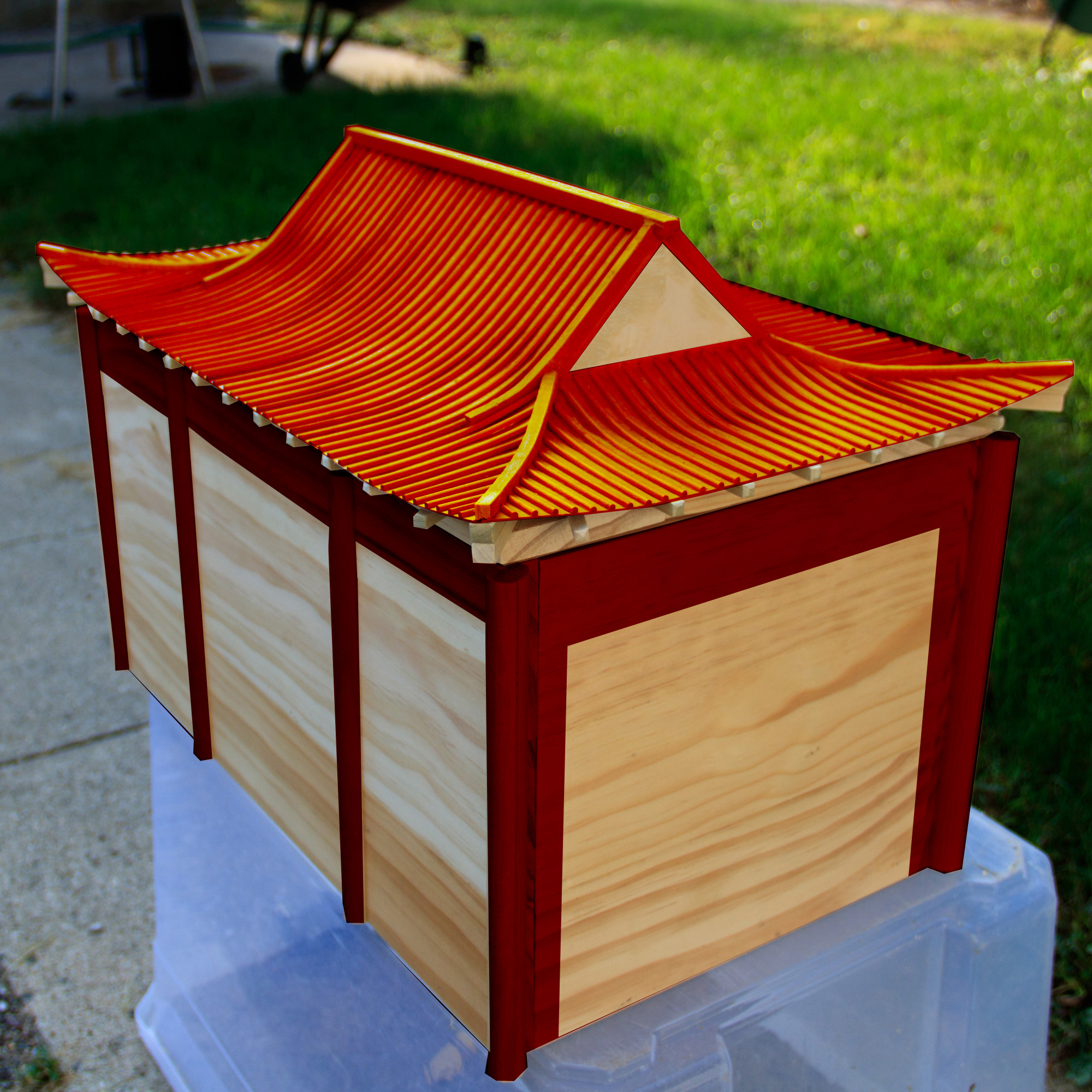
I was also looking at the photos from my trip to China. I really liked the look of the Forbidden City. The colors of the palace were pretty consistent with what I would consider "the colors of China."
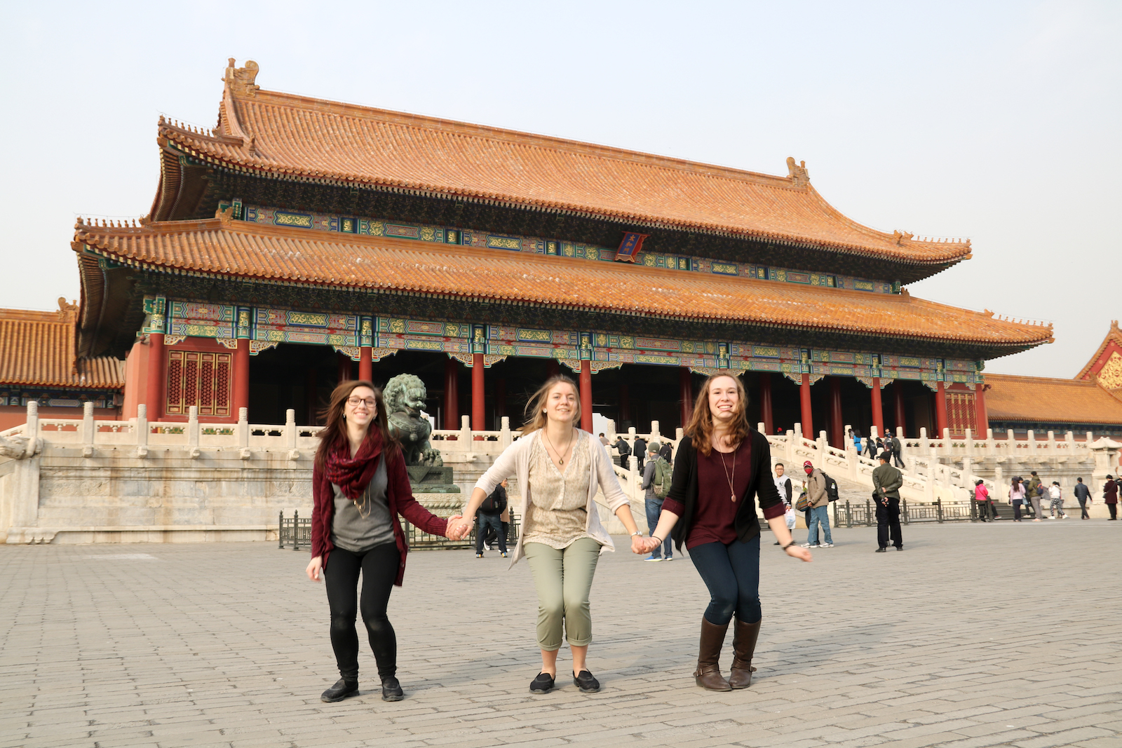
Using Photoshop, I simplified the ornate design so I had an idea of what my base colors would be.
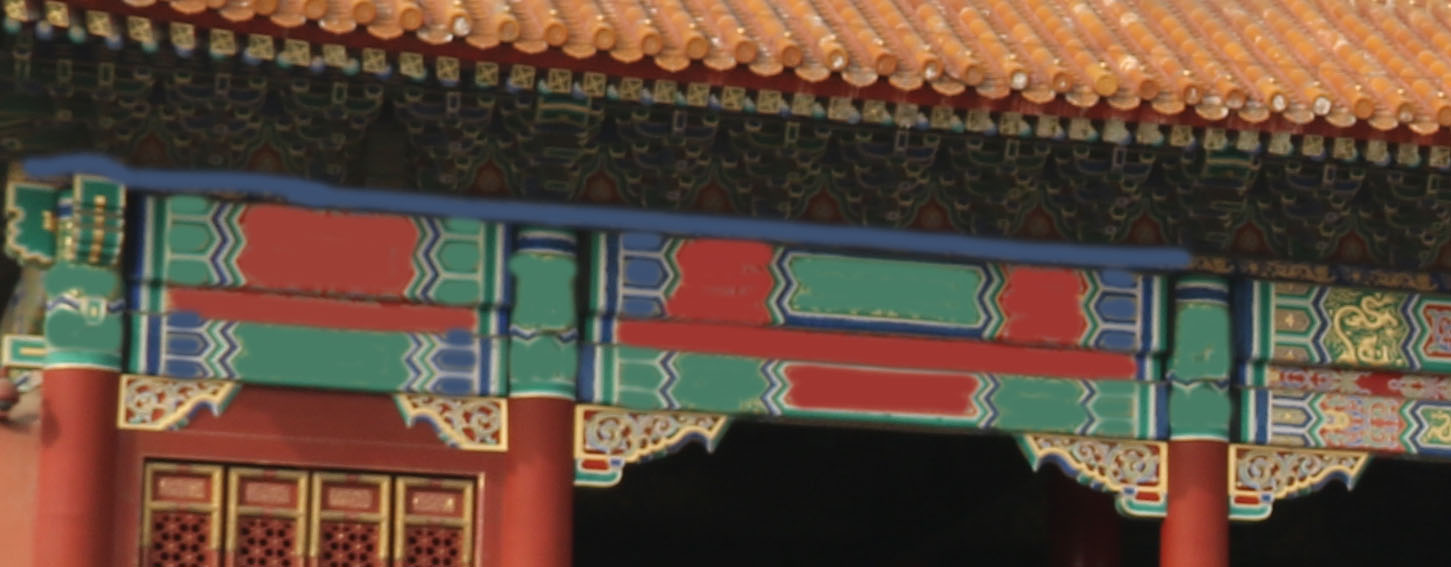
I used an acrylic based stain to paint the wood. I wanted the roof to be orange and my color options came in two varieties: not-very-orange and very-very-orange. I decided to go with very-very-orange, officially I think it was called Tangerine. Unfortunately, this color only came in quart size, so I ended up buying a lot more than I needed. If I was going to redo this, I might opt for a different yellow-orange color which I could get in a small sample size.
When working with wood, I prefer to stain rather than paint it. I like being able to see the wood grain. Or, I at least like the possibility of seeing the wood grain.
For the other colors, I used a different brand of acrylic stain. I opted for the opaque option, since it gave me the colors I wanted. I ended up buying Temple Green, Amsterdam (Blue), Navajo Red, and Mystic Black. For accent colors and designs I purchased little bottles of Gold and White paint.
I used Tape to mark off the main divisions of color and a few of the finer areas on the roof, but for the most part the painting was all freehand. The colored stains worked really well. The Mystic Black was a little more translucent than the others and I noticed it went on a little splotchier than I had hoped. That's what I get for not using a wood conditioning coat. I suspect this this will be the one little thing which bugs me about the project in the future.
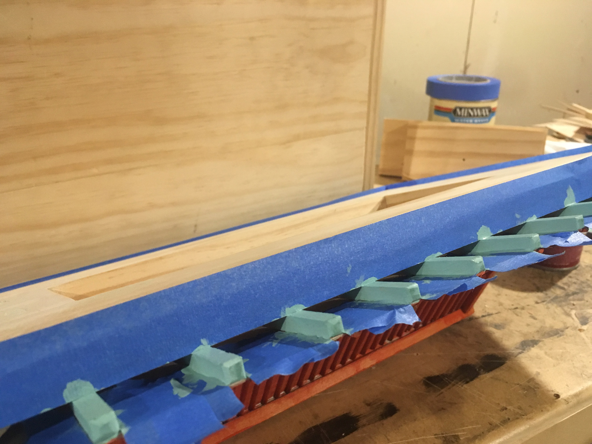
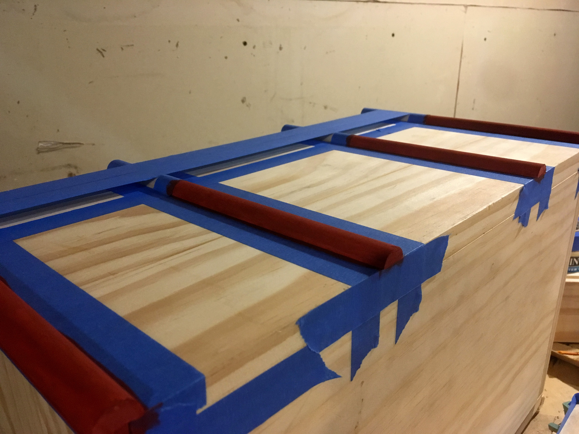
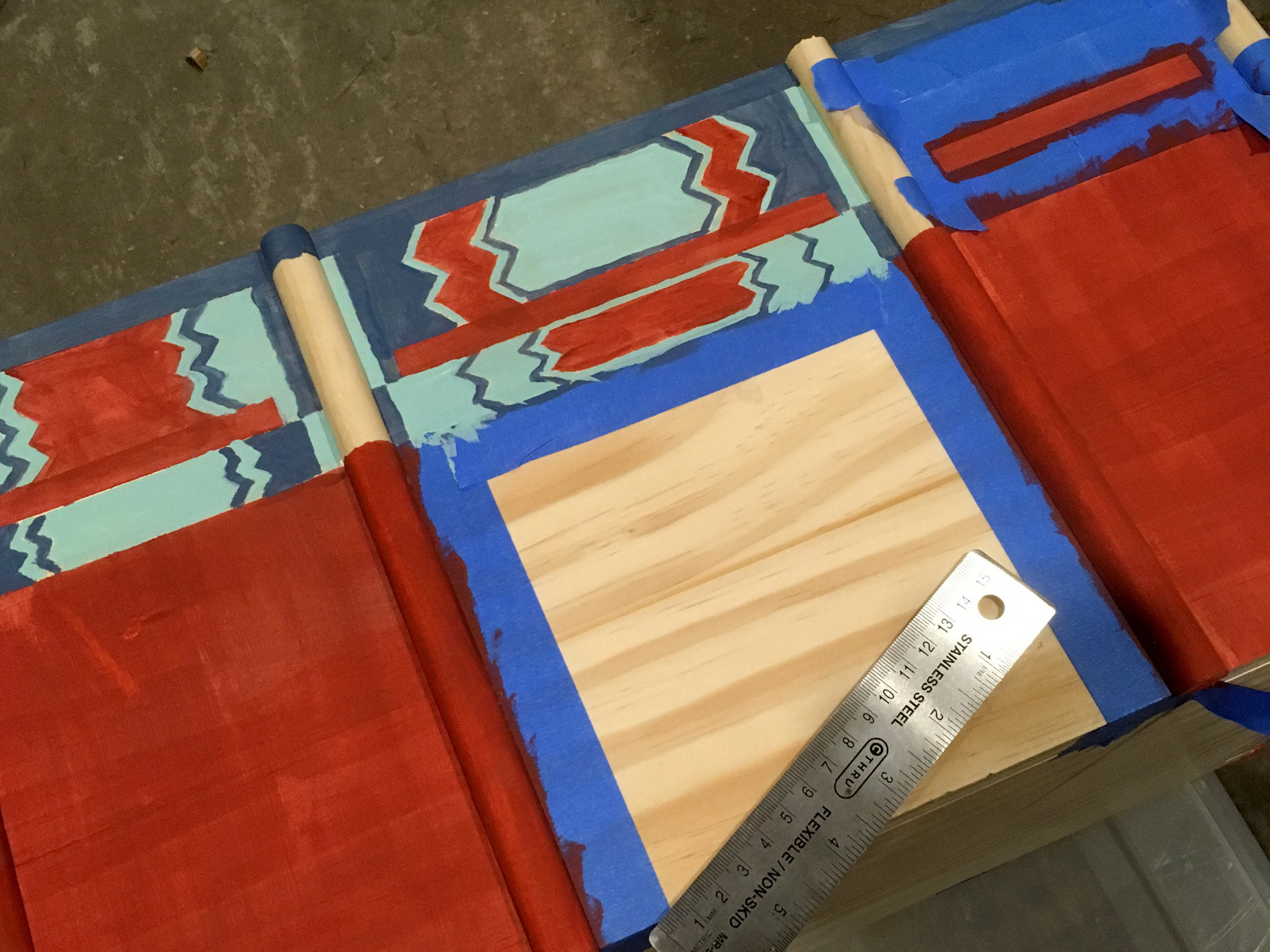
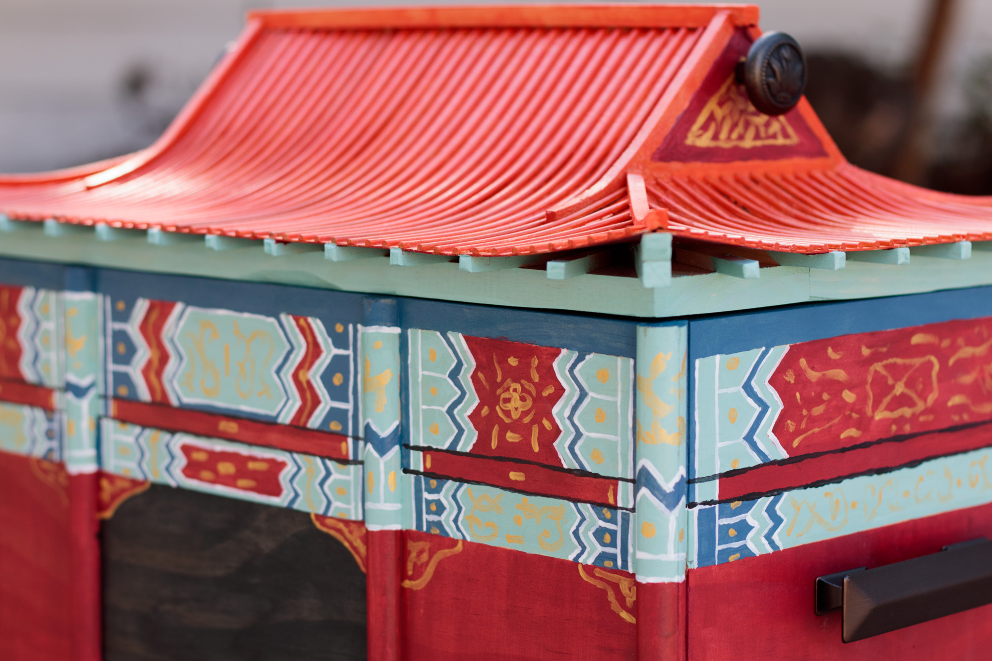
My jagged lines along the top felt more American Indian to me than Chinese. I hoped that the decorative flourishes would help it to feel a little more Chinese.
There was no way I could be as ornate or detailed as the actual, real life, palaces. So I decided my artistic style for this would be simplified. Actual palace detail:
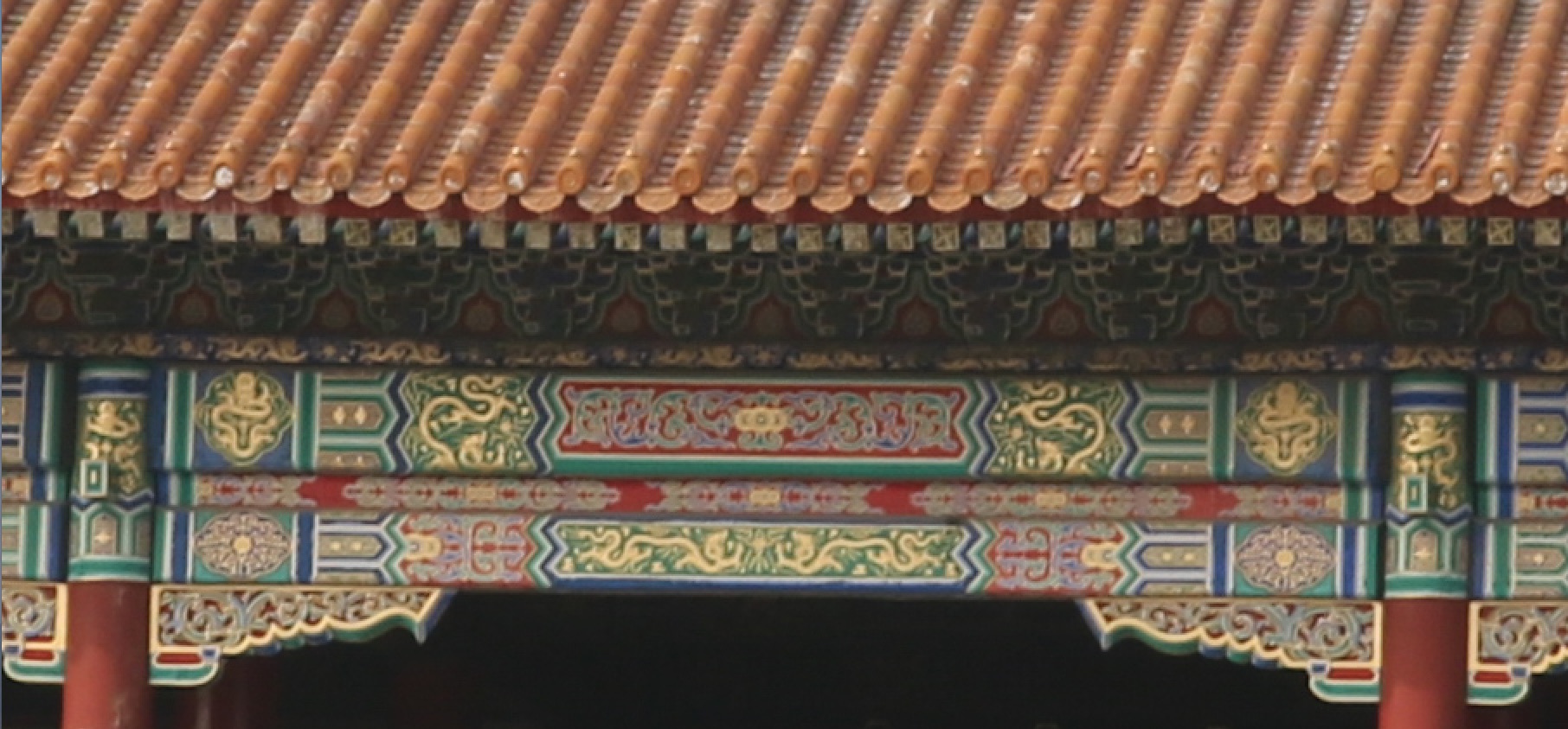
Often in China I felt that things were always under construction. The weather, the pollution, and the building materials were always in conflict with each other and buildings were often well weathered. While I have a pretty strong perfectionist streak, I knew that this box was going to be far from perfect when I got done and I wanted to embrace that as part of the boxes' style. I kind of wanted the box to look like it was maybe in need of repair. Not that I wanted it to look old or broken, just that it wasn't polished.
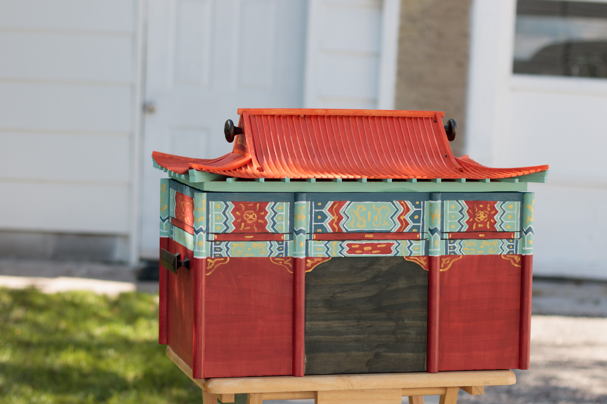
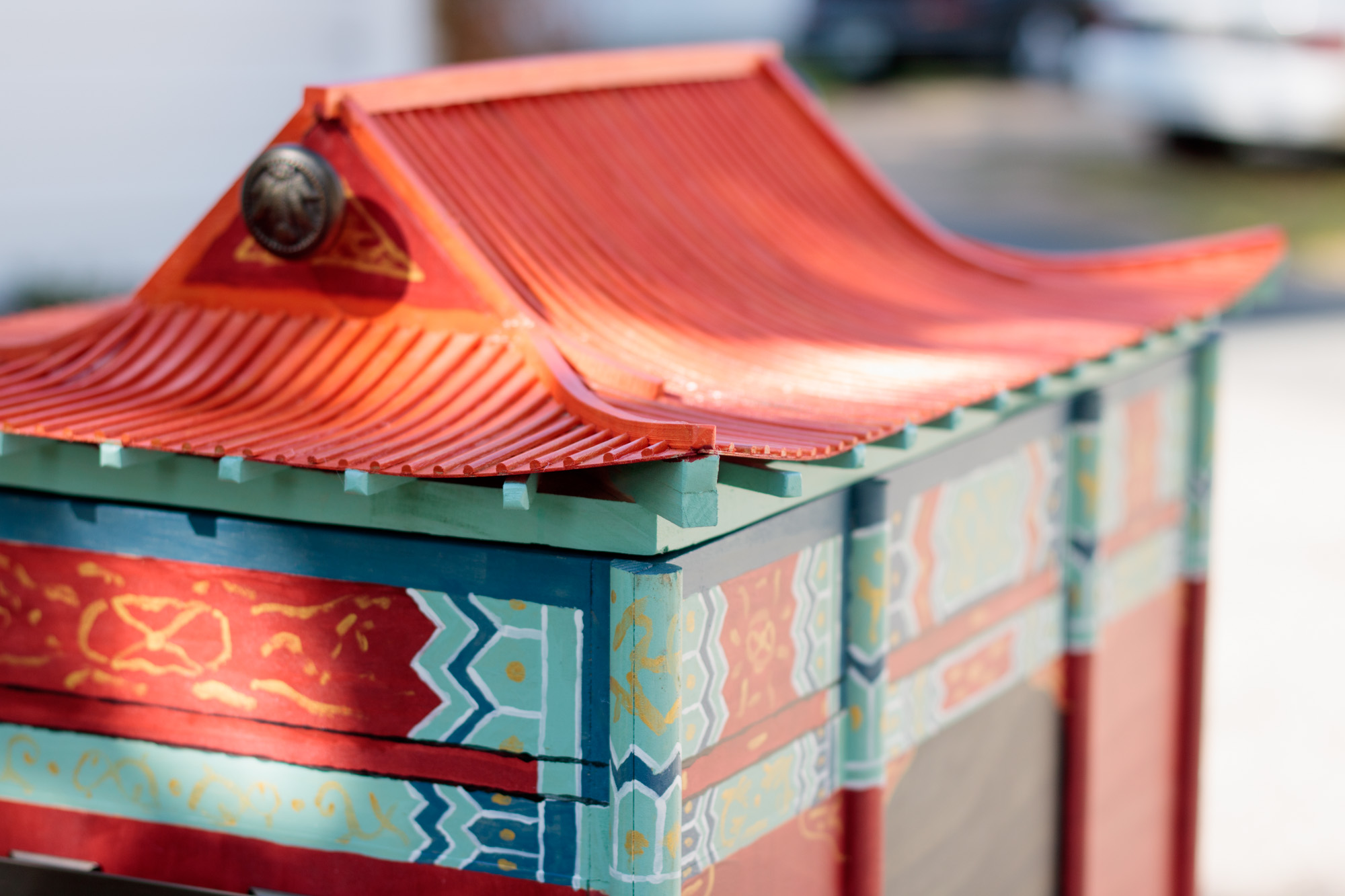
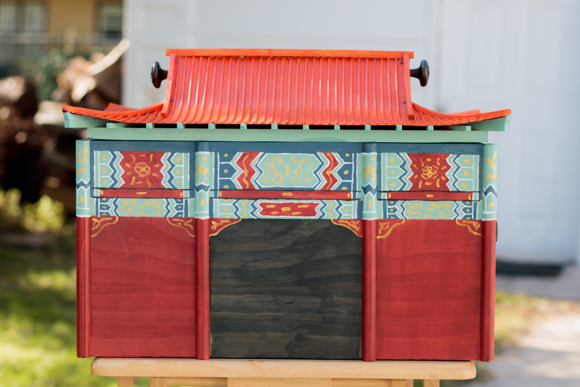
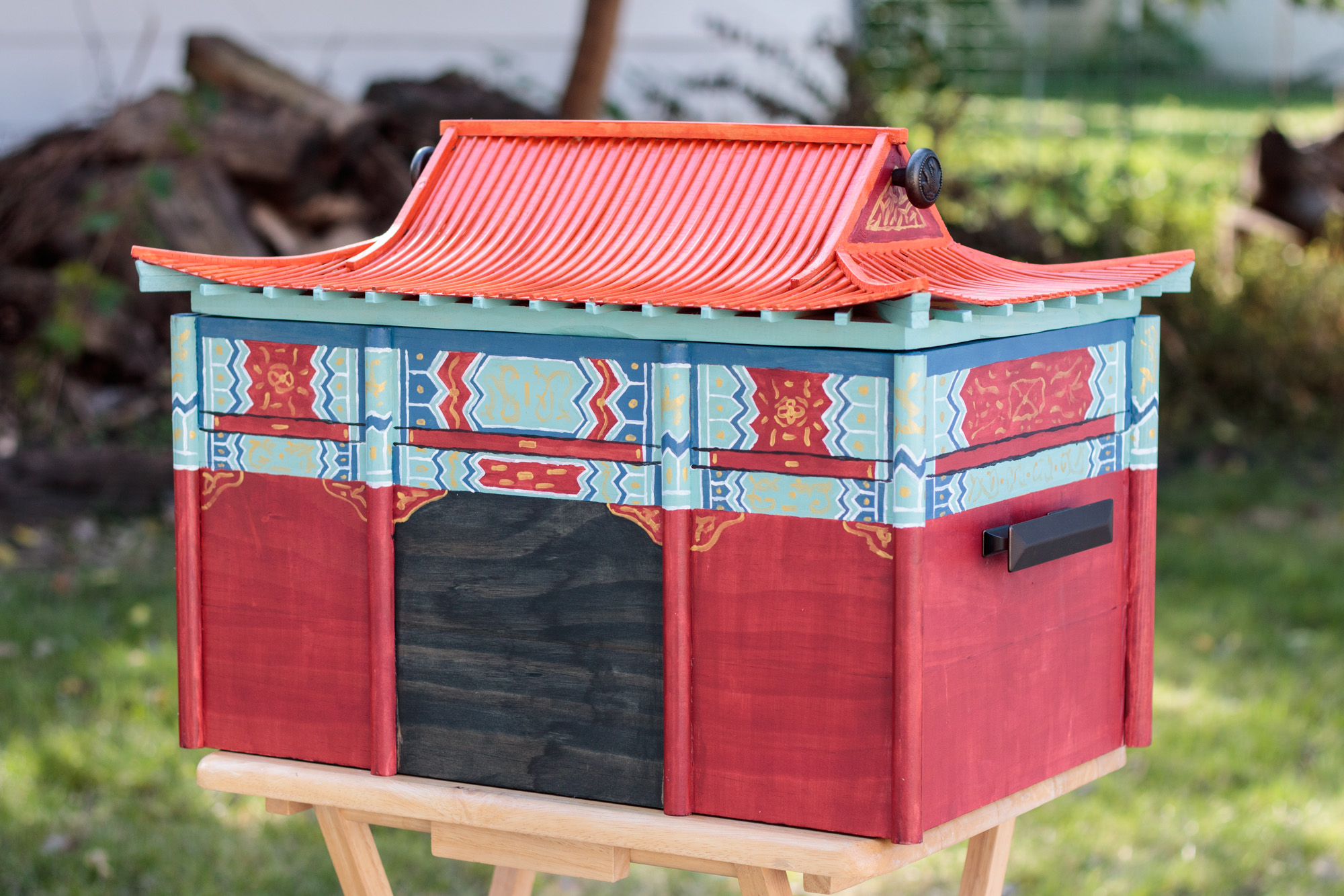
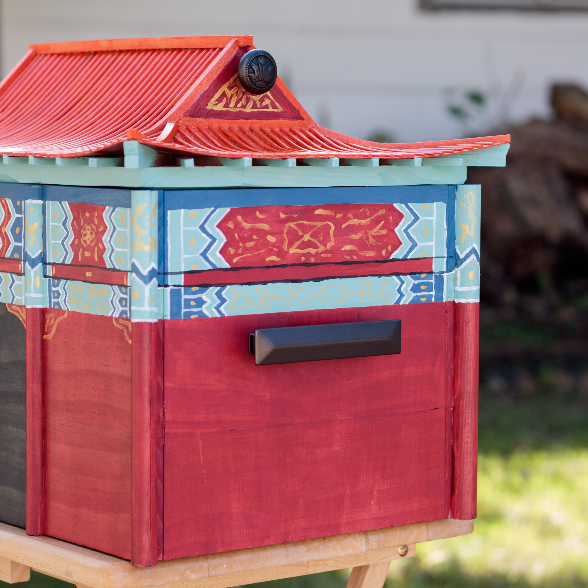
I used a spray polyurethane to coat the outside of the box and give it a little gloss. I also added handles to the roof and to the sides of the box. Originally, I wanted the roof to be hinged, but it was far easier to make it lift off. This was I didn't need to worry about the eaves breaking if the lid hinged too far.
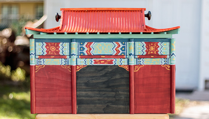
Overall, I'm very pleased with how it turned out. One last tough will be adding a few stacking internal trays. Right now, it's just one big open space, but I have a lot of little pieces which can go inside. Below are a few more photos of the finished product.
