Technology has reached a point where consumers are literally afraid of their electronics. They are not afraid that the electronics will attack or hurt them, but rather afraid that if they touch something, they will break it. This has several implications, which are rather discouraging for the more tech minded individuals.
To begin, allow me to illustrate the problem.
Let’s say that you develop the concept of a car. You design a car, you engineer a car and you are finally able to build a car. After finishing this tremendous project, you take it out and show it to people. You say, “Look at this! It’s a car! Isn’t it neat? You can have it! Go ahead and use it!”
After leaving the car in their hands, you leave, only to return several hours later to find twenty or thirty people pushing the car to the top of a hill, climbing onto the roof, and riding the car down the hill. You look on in horror as the car smashes into a tree, at which point everyone picks themselves up off the ground, brushes themselves off, and begins to push the car up the hill again.
This is not at all what you expected, so you try to explain: “Wait! Look, see? You can open the door and go inside! There’s a steering wheel! You can make it turn! There is a radio, you can listen to music! There are breaks, so you don’t hit trees! Why are you pushing it up the hill?! You could drive it up the hill, in fact, you could drive it down the hill, or anywhere you want! You can use it for so much more? Don’t you see!?!?”
The problem that we face is the result of many issues. The first being:
Features are not immediately obvious.
The people building the technology take their work for granted. They added or designed features that made sense and they understand it perfectly. It’s completely obvious to the builder that a car should have a steering wheel. Isn’t that common sense? You should be able to set the home page on your web browser, right? Doesn’t everyone know that? In short, no. It’s an additional feature, not a requirement, and as such many people will not even think about it.
Users don’t always understand the language used.

If users don’t understand what a feature does, it doesn’t matter if they can find it or not. Granted, helping them to find the feature is the first step, but they are not going to go out looking for the feature unless they either know that it should be somewhere or they just want to dabble around. The users are more than happy to ride the car down the hill. It’s fun and exciting, it does what they want. Why do they need more?
Users are afraid of breaking things.
If a user has something that works for their needs, they have no reason to go and change anything. It might break something, and if it does break something, they may not be able to put it back to how it is now.
This ties in greatly with the last issue. If users don’t understand what is being said, they won’t use the feature because they don’t know what it does. But they are afraid to try new things because they fear that doing something they don’t understand will completely break what they have.
In some respects, this is a good fear to have. Users shouldn’t go around deleting random files from their system folder. (Or for that matter, any files from their system folder.) When it comes to learning more about their computer and features that they have, it is counter productive.
I don’t really know why I should put this smelly liquid in my car. What if that means I can’t ride it down the hill? What if that breaks it? What if that’s not suppose to go in there? I’m fine how I am, I won’t touch anything.
What can we do about it?
The solution is not a simple project. The good news is that the younger children today are becoming much more adept at working with the newer technology. The learn quickly and are more willing to try new things. It’s the older generation of users that will need more help in learning their way around things.
For the consumers we need to find a way of explaining the features, the language and how to explore the program. Once the users begin to understand, they will be much more capable of handling issues on their own.
While educating people about technology, though, it is important to also educate the technology creators and designers so that they understand how to view their design as if they are a first time user.
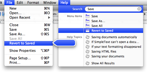
Before I end, let me give one example of a cool new feature which I think is really a great step in the right direction.
Apple has done a really neat thing with the Help menu in Leopard. The Help menu contains a search box which not only searches thee help documents, but also searches the menus for options. This is a great feature to help explore the program and to find features. We need more things like this.
